
7 Essentials Your Pilates Studio Website Needs to Attract (and Keep) Students
12/22/2025
In a world where competition is constant, standing out matters more than ever. If you’re running a Yoga or Pilates studio, your website is often the first interaction someone has with your space. See it as the most crucial moment to introduce your approach, your offer, and your teaching philosophy – all the elements that make your studio unique. As a matter of fact, visitors make decisions in seconds, so your site needs to guide them seamlessly, helping them find the information they need immediately.
After working with many studio owners over the years, I’ve gathered the most important insights and summarised them into seven essentials that will help your Yoga or Pilates studio website turn curious visitors into committed clients:
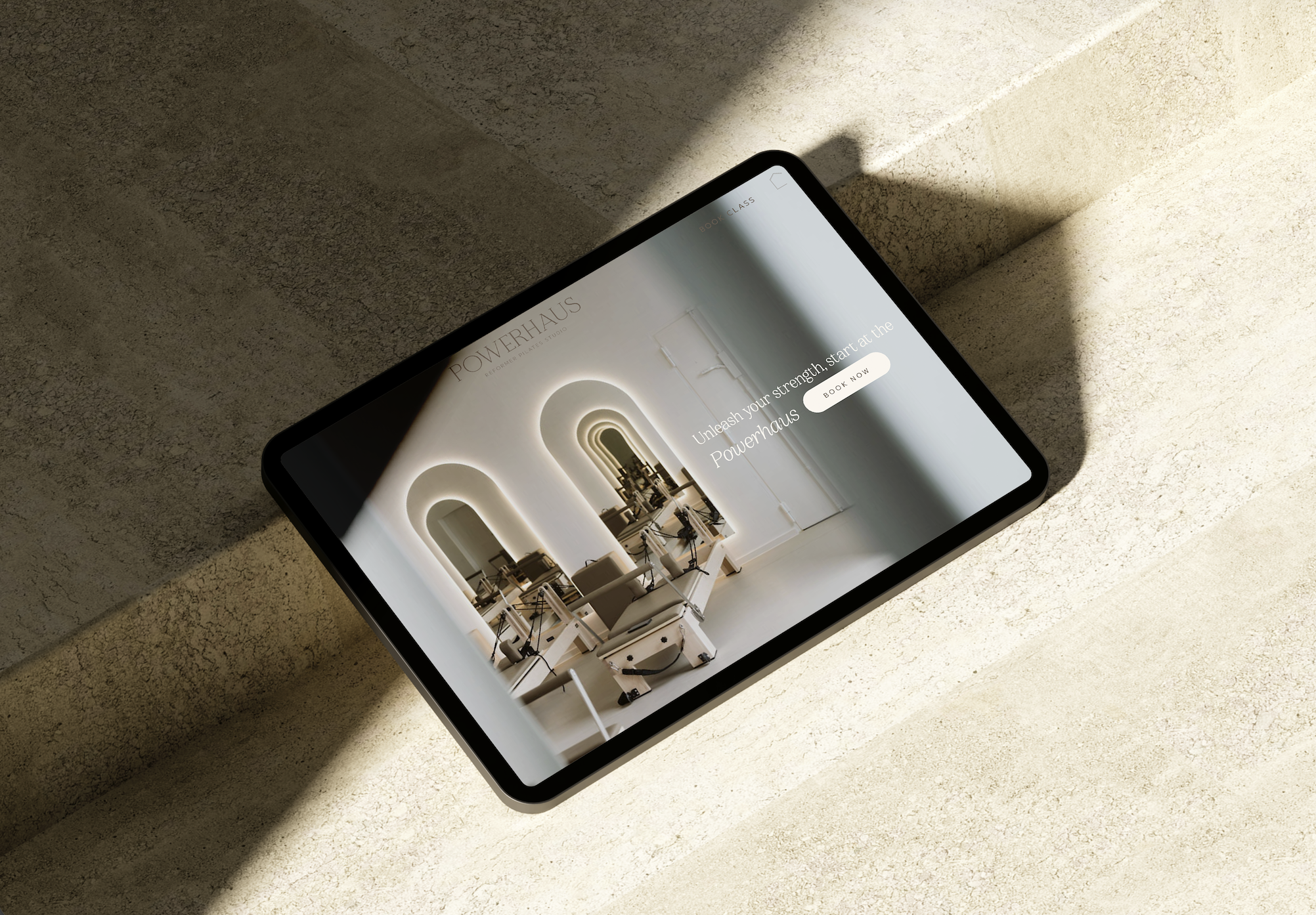
1. A Clear and Direct CTA
To begin with, your homepage should immediately point people in the right direction. For almost every studio, that means a bold, unmistakable “Book a Class” button.
Place it above the fold, repeat it throughout the page, and make it visually distinct. Because the fastest way to lose a potential student is to make them getting lost in the process. Keep it simple and intuitive.

2. A Welcoming ‘New Students’ Section
Do your remember when you practiced yoga or Pilates for the first time? As it can be daunting to try something out of our comfort zone, your studio website should feel inviting and supportive, especially for people new to the practice. A dedicated beginner section removes uncertainty and reassures visitors that your space is supportive, welcoming, and ready to clarify any initial questions they might have.
This is the perfect place to share:
– How to get started
– What to bring (you can place this in a small FAQ section)
– What to expect in a first class
– Intro offers or trial passes
– How to book
– Testimonials from students who were once beginners themselves
Your aim is simple: help people feel comfortable, seen, and supported.
3. Crystal-Clear Class Offerings
Your visitors are most likely browsing your site for more information on your studio. Therefore, they should immediately understand what you offer. Spell it out clearly and make it easy to understand:
– Reformer Pilates
– Mat Pilates
– Yoga (with a breakdown of your class types)
– Pre- or postnatal sessions
– Private sessions
– Workshops or speciality classes
But don’t stop at the titles. Describe what students will experience and feel in each class. This helps them choose the right option and builds trust before they even walk through your studio door. Moreover, make sure to mention the level required for each session. Because nobody enjoys surprises when they show up ready to move ;)

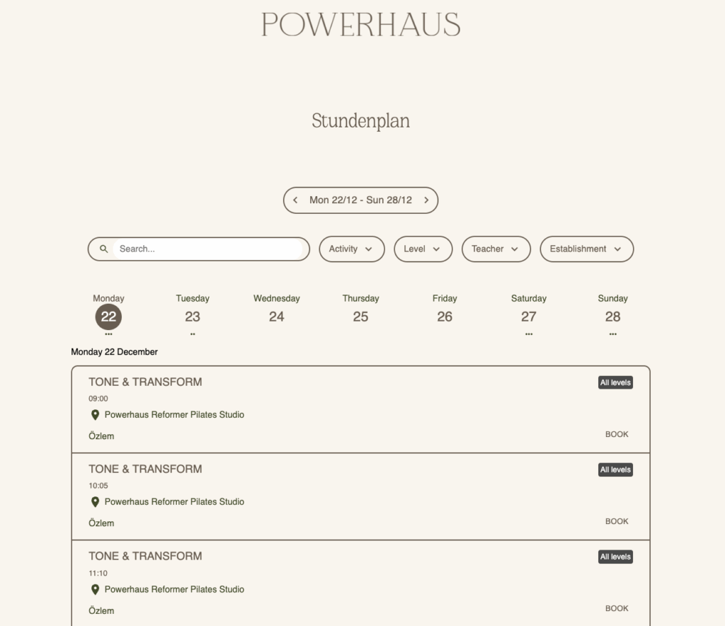
4. Smart Use of Booking System Integrations
Your end goal for every website visitor is to book a class. A functional website paired with a seamless booking experience is a dream for both you and your students.
Most booking platforms offer integrations you can embed directly into your Yoga & Pilates studio website, including:
– Class schedules
– Memberships and class passes
– Newsletter signup
– Chat functions
– Pop-ups or offers
Two excellent booking tools for Pilates studios are Momence and Bsport. I partner with both, so if you’re thinking about switching from your current system or setting one up for the first time, feel free to reach out – I am more than happy to connect you with a special offer.
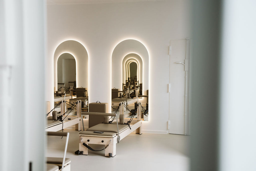
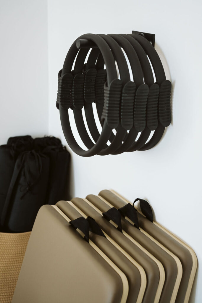
5. Beautiful, Professional Photography
I cannot mention this often enough: photography can make or break your Pilates studio website. It sets the tone instantly: the atmosphere, your aesthetic, your teaching style, the energy of your space.
Without doubt, good photography signals professionalism and creates trust. It also elevates every page of your website. Investing in professional images early on will make your studio look polished, credible, and aligned with the experience you offer. Studio OAX is connected with a wide network of photographers, so feel free to reach out if you need recommendations.


6. The Five Must-Have Pages
Every effective Yoga & Pilates studio website should include:
– Home — your first impression. This page should introduce your studio and link to all other key sections.
– Classes — explained with enough detail to help people choose the right option.
– Pricing — an overview of all your packages, memberships, and any intro offers.
– Schedule — ideally embedded directly via your booking system for a seamless experience.
– About — your story, your values, and your team. This is where you connect with new students.
– Contact — make it easy for people to reach you for more information or questions.
Put some extra care into these pages. They’re essential as they help potential students understand who you are and if your studio is the right place for them.
7. Simple, Accessible Contact Options
Lastly, people often have follow-up questions – about injuries, fitness levels, equipment, parking, or private sessions. For that reason, your website should make it easy for them to reach you.
Make sure to include:
– A contact form
– A visible email address
– (Optional) A phone number
– (Optional) A live chat via your booking tool
To sum up, make communication easy, your students will appreciate it :)

Reach Out If You Need Help Building Your Studio’s Website
Given that website is your digital business card, it should reflect the energy of your physical space and make it inviting for people to browse, learn more about your offer and book a class. When designed well, it becomes one of your most powerful tools for converting visitors into loyal students.
In case you need help creating a brand and website that reflects your studio, I offer both template customisation and fully bespoke websites tailored to wellness and movement businesses.
Feel free to reach out – I’d love to support you in building something meaningful and strategically beautiful.
*all photos on this page by Karoline Kirchhof for Powerhaus.
X, Lara


