When we think of brand identity, we often picture logos, colours, and imagery. But one essential element that sometimes flies under the radar is typography. The fonts you choose say as much about your brand as any other visual cue, subtly setting the tone and shaping the viewer’s perception from the first glance.
So, why is typography so important for building a memorable brand, and how do you choose the right fonts to communicate your unique personality? Let’s dive in.
Why Typography Matters in Branding
Typography is more than just the style of letters on a page – it’s the voice of your brand. Just as the tone of voice you use in your writing tells people who you are, so does the font you choose. Typography can convey elegance, playfulness, strength, or trustworthiness. Choosing fonts thoughtfully ensures your brand resonates with the right emotions and sticks in the minds of your audience.
Consistent typography across all brand materials helps build recognition. When done right, a unique font combination can become as recognisable as your logo. It’s a way to build familiarity and trust while expressing your brand’s personality.
The Main Font Types and What They Communicate
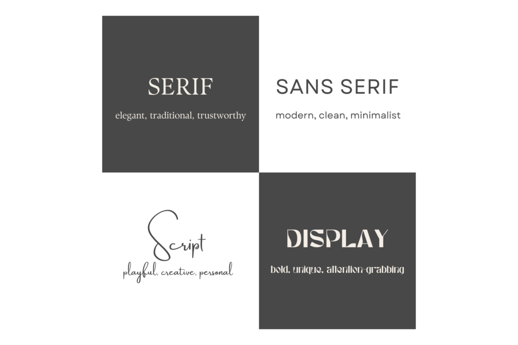
There are four main font families and each brings its own mood, style, and flair. Let’s have a look at what they say about your brand:
- Serif Fonts
Serif fonts, like Times New Roman or Garamond, have small “feet” or decorative strokes at the ends of each letter. These fonts are classic, elegant, and convey a sense of tradition. They’re popular with brands wanting to communicate reliability, authority, or a sense of heritage (think high-end fashion or publications). Best for: Brands that want to appear trustworthy, professional, or established. - Sans Serif Fonts
Sans serif fonts, such as Helvetica or Arial, don’t have those decorative strokes, giving them a clean and modern look. They communicate simplicity and are often chosen by tech companies and brands aiming for a contemporary feel. Sans serif fonts are also versatile and highly readable, making them perfect for both digital and print use. Best for: Modern, forward-thinking brands that want to appear approachable and straightforward. - Script Fonts
Script fonts mimic cursive handwriting, ranging from highly decorative to simple, hand-written styles. These fonts add personality, elegance, or a playful touch to a brand. Because of their intricate design, script fonts are best used in small doses, like in logos or titles, rather than in long paragraphs. Best for: Creative or personal brands that want to exude warmth, elegance, or a bespoke feel. - Display Fonts
Display fonts are bold, decorative, and often highly stylised. They’re meant to stand out and capture attention, making them ideal for headlines or logos. Display fonts can add a lot of character to a brand but should be used sparingly to avoid overwhelming your audience. Best for: Bold brands that want to make a statement and stand out as unique or even experimental.

Choosing Fonts Based on Your Brand Personality
When choosing typography, think about how your brand’s personality aligns with these font types. Consider questions like:
- Is your brand more traditional or modern?
- Do you want to appear playful or serious?
- Are you aiming for luxury or approachability?
For example, if you’re building a sustainable skincare brand, a sans serif font with a soft, organic feel could capture a clean, eco-friendly vibe. Or, if you’re creating a luxury jewellery brand, a serif font may convey sophistication and trustworthiness. Of course, these are just guidelines and every brand is unique and different, so play around and see what works best for you.
Combining Fonts for Impact
Pairing fonts adds more layers to your brand’s identity. Many successful brands use two or three fonts in tandem:
- Primary Font: Used in your logo and headers to establish brand identity.
- Secondary Font: Complements the primary font, often used for body text or subheadings.
- Accent Font (optional): Adds flair, such as a script font for callouts or tagline text.
Aim for contrast and harmony – your fonts should be different enough to add interest but similar enough to feel cohesive. For example, pair a bold sans serif for headers with a clean, readable serif for body text. Or combine a decorative display font for the logo with a simple sans serif for other text.
Where to Find Fonts
Whether you’re just starting or ready for a rebrand, these sites can help you discover fonts that match your vision:
- Google Fonts: A free, extensive collection of web-friendly fonts.
- Adobe Fonts: Offers a high-quality library and integrates easily with Adobe Creative Suite.
- Font Squirrel: Features free fonts for commercial use with an excellent variety of styles.
- Creative Market & MyFonts: Great for unique, premium fonts crafted by independent designers.
- Behance & Pinterest: If you need inspiration, these platforms showcase creative font pairings and brand designs that can spark ideas for your own typography.
Take your time to explore font options and try out combinations. A well-chosen font selection makes a powerful impression, helping your brand stand out and connect with your audience.
Final Thoughts on Choosing Typography
You get the idea, choosing typography is not just a small detail, it’s one of the most impactful tools in your branding toolkit. When done thoughtfully, it brings out your brand’s character, creates consistency, and makes a lasting impression.
If you’re ready to develop a brand identity that’s both beautiful and meaningful, reach out to me. Together, we’ll find the perfect typography to capture your brand’s essence, choose the right brand colours and design a logo that brings your vision to life.
And if you’d like to start building your brand before we speak, my FREE 12-step guide that will get you clarity on your brand vision might just be right for you.
Lots of love,
Lara